Thursday, 4 March 2010
Tuesday, 22 December 2009
Evaluation
In what ways does your media product use, develop or challenge forms and conventions of real media products?
As I detailed in this post, short films tend to adhere to certain codes and conventions such as, for example, tending to have a plot twist at the end. For our production we tried to keep to these codes, this (hopefully) can be seen in our film where the main protagonist finds that instead of everybody else going backwards, it was actually him all along.
We found it fairly hard to locate films that shared a similar narrative to ours, possibly because our final idea was an amalgamation of two ideas that had already been derived from other ideas.
Our film has tried to follow Todorov's narrative theory (Equilibrium - at the start where the main protagonist is getting up and is unaware that anything is wrong. The disequilibrium occurs when he sees other people going backwards and gets confused. The recognition of the disequilibrium occurs when he speaks to the Blue Man who explains why it all is happening and as he finishes speaking everything rewinds back to the start to create a new equilibrium.
To provide further exposition to the audience, ideally we should have included footage at the end showing that everything had returned to normal (for example by including footage of him seeing people walking forwards instead).
How effective is the combination of your main product and ancillary texts?
As part of the specification, we had to design and create two ancillary texts and we chose to do the film poster and the magazine review.
The magazine review itself wouldn't usually be linked to the film production company (unless is was part of a larger conglomerate).
The poster on the other hand is one of the film industries biggest forms of advertising, being located on billboards, buses, trains, in the cinemas themselves and even (in some cases) on whole buildings. Some films have developed upon the traditional poster by making them 3-D! Or even making large models to advertise them (anyway, I digress).
Ancillery Text 1 - The Magazine
I think the combination of our magazine and our main product works well, despite the things pointed out above (about magazines not usually being tied in with the film itself.
The content of the magazine fits our target audience and also gives good background information on the filmakers and other aspects surrounding the film, like real magazines.
Ancillery Text 2 - The Poster
For our poster, we decided it would be good to have both the main characters taking up most of the space. This was to show the audience that these would be the two main charactersthat they would be seeing throughout the film. We also decided that only showing half of each of their faces would suggest that there are two sides to each, however, one side will be seen more than the other for example, Gordon's more depressed side will be the focus of the story. The title was done similarly to the teaser poster as in we decided to reverse the title and the tagline and fade it a bit. This was done to signify that something is going backwards (in this case it's everybody but the main protagonist).
The medal in the middle having a slight glow around also provides anchorage to this object being the magical item in the narrative (refering to Propps Narrative Threory). The fact that the medal is located fairly centrally signifies that it will have some relevance to the narrative. Both the characters have the name of the actor that played them underneath, they also both have the word 'introducing' above their name to show that they are both unknown actors. This is generally the case for most short films as a lot of companies tend to try get new talent each time they make a film to diverse themselves and also give actors a better chance of getting into film.
 We chose to have the Guardian review us as they are more typically artistic and critical in what they view. Also being slightly mire upper class then some papers such as The Mirror and The Sun we thought they would be more likely to review a short film. We chose for them to give us 4 stars as it shows that we aren't too modest about ourselves, but also generally a 4 star would be given to a film made of an introductory cast to show that the actors have potential. This is another reason why we chose Empire as well. They will generally review big films of cinema rather than small films as their market is 15- 35 demographic and also middle-working class where they may not be as bothered about small films. However, they do tend to look into short films a little bit to widen their audience appeal and bring in other classes of society which means they select which short films they will look at more carefully, which means they would believe our film to have Potential. However, through feedback, we thought it would probably be better to avoid putting Empire on because the film is a first time, and probably wouldn't have enough hype for them, therefore we replaced it with a comment which was a view on our film. This is much more realistic as independent films will generally not get as many reviews from big names, but will get quite a few comments from small time, maybe big time critics.
For our tagline, we decided to change it from what it was in the teaser poster to what it is now in the main one. We though 'Time to take a step back' didn't reflect the narrative of the story enough where as 'Ever feel like living life in reverse?' does,a s it shows that the character will obviously have their life turned backwards at somepoint in the story, which shows the audience that this film wont be normal one.
Due to feedback, we changed our two main images. This was also because the narrative had slightly changed. This meant the school no longer had any significance in our film, and wouldn't work as the centre piece of the poster. Also the title was a bit bland so we changed it to being gradient to blue, which also fitted with the framing of the blue man. The picture of Ben Gibson had to be changed also, since he was no longer Gordon.
What have you learned from your audience feedback?
We have learned a lot from our audience feedback and it is this that made us change things throughout production, starting right after we showed the initial animatic to the class (a group of about 10-15 17/18 year olds).
Initially, people were doubtful as to whether we would be able to produce a film which incorporated the backwards elements but we knew that we had the tools and skills to be able to make the video track go backwards. This did mean that we had to reduce the amount of dialogue as that would be very hard to do in reverse.
After we'd finished filming the first initial waking up/getting ready scenes we and the audience noted various things, such as:
There was a slight bump in the camera when tracking the main protagonist down the stairs,
You can see the blue man stand up when the main protagonist takes the bowl out of the microwave (you are supposed to see his reflection but not him standing up)
On the whole, the introduction needed a soundtrack to cover it.
We listened to this feedback and although we couldn't find the extra time to do a re-shoot we tried to edit it so that they were less obvious. I did record a soundtrack though at home. The soundtrack had a sort of jazzy/lazy morning feel to it which doesn't alarm the audience who don't think anything is wrong.
After completing the rest of the filming, the feedback that we received was that when the Blue Man was speaking, it was very hard to hear what he was saying. Some people said that it he would be better as a mute, and speak backwards instead if at all. However, we were not able to re-film and devise a new screenplay in time so instead we dubbed over the blue man (which would work easy since you can't see what he's saying anyway due to the Morphsuit. We had also added music over the ending re-wind and credits which the audience said worked very well.
Slightly less noticeable to the audience was the jump in the music when the main protagonist enters the school, this is due to the fact that the soundtrack that I made was slightly too long but I think that, due to some careful editing, it blends in seamlessly.
Other feedback given to us by our teacher included that, at the moment, our films twist is very weak and doesn't create the reaction we intended therefore including all this should make it more creepy.
How did you use new media technologies in the construction and research, planning and evaluation stages?
Throughout the production of the film we have been using varying new technologies to carry out different tasks.
For example, for the construction of the film itself we used various pieces of software on Apple Macs and Windows operating systems such as:
As I detailed in this post, short films tend to adhere to certain codes and conventions such as, for example, tending to have a plot twist at the end. For our production we tried to keep to these codes, this (hopefully) can be seen in our film where the main protagonist finds that instead of everybody else going backwards, it was actually him all along.
We found it fairly hard to locate films that shared a similar narrative to ours, possibly because our final idea was an amalgamation of two ideas that had already been derived from other ideas.
Our film has tried to follow Todorov's narrative theory (Equilibrium - at the start where the main protagonist is getting up and is unaware that anything is wrong. The disequilibrium occurs when he sees other people going backwards and gets confused. The recognition of the disequilibrium occurs when he speaks to the Blue Man who explains why it all is happening and as he finishes speaking everything rewinds back to the start to create a new equilibrium.
To provide further exposition to the audience, ideally we should have included footage at the end showing that everything had returned to normal (for example by including footage of him seeing people walking forwards instead).
How effective is the combination of your main product and ancillary texts?
As part of the specification, we had to design and create two ancillary texts and we chose to do the film poster and the magazine review.

The magazine review itself wouldn't usually be linked to the film production company (unless is was part of a larger conglomerate).
The poster on the other hand is one of the film industries biggest forms of advertising, being located on billboards, buses, trains, in the cinemas themselves and even (in some cases) on whole buildings. Some films have developed upon the traditional poster by making them 3-D! Or even making large models to advertise them (anyway, I digress).
Ancillery Text 1 - The Magazine
I think the combination of our magazine and our main product works well, despite the things pointed out above (about magazines not usually being tied in with the film itself.
The content of the magazine fits our target audience and also gives good background information on the filmakers and other aspects surrounding the film, like real magazines.
Ancillery Text 2 - The Poster
For our poster, we decided it would be good to have both the main characters taking up most of the space. This was to show the audience that these would be the two main charactersthat they would be seeing throughout the film. We also decided that only showing half of each of their faces would suggest that there are two sides to each, however, one side will be seen more than the other for example, Gordon's more depressed side will be the focus of the story. The title was done similarly to the teaser poster as in we decided to reverse the title and the tagline and fade it a bit. This was done to signify that something is going backwards (in this case it's everybody but the main protagonist).
The medal in the middle having a slight glow around also provides anchorage to this object being the magical item in the narrative (refering to Propps Narrative Threory). The fact that the medal is located fairly centrally signifies that it will have some relevance to the narrative. Both the characters have the name of the actor that played them underneath, they also both have the word 'introducing' above their name to show that they are both unknown actors. This is generally the case for most short films as a lot of companies tend to try get new talent each time they make a film to diverse themselves and also give actors a better chance of getting into film.
 We chose to have the Guardian review us as they are more typically artistic and critical in what they view. Also being slightly mire upper class then some papers such as The Mirror and The Sun we thought they would be more likely to review a short film. We chose for them to give us 4 stars as it shows that we aren't too modest about ourselves, but also generally a 4 star would be given to a film made of an introductory cast to show that the actors have potential. This is another reason why we chose Empire as well. They will generally review big films of cinema rather than small films as their market is 15- 35 demographic and also middle-working class where they may not be as bothered about small films. However, they do tend to look into short films a little bit to widen their audience appeal and bring in other classes of society which means they select which short films they will look at more carefully, which means they would believe our film to have Potential. However, through feedback, we thought it would probably be better to avoid putting Empire on because the film is a first time, and probably wouldn't have enough hype for them, therefore we replaced it with a comment which was a view on our film. This is much more realistic as independent films will generally not get as many reviews from big names, but will get quite a few comments from small time, maybe big time critics.
For our tagline, we decided to change it from what it was in the teaser poster to what it is now in the main one. We though 'Time to take a step back' didn't reflect the narrative of the story enough where as 'Ever feel like living life in reverse?' does,a s it shows that the character will obviously have their life turned backwards at somepoint in the story, which shows the audience that this film wont be normal one.
Due to feedback, we changed our two main images. This was also because the narrative had slightly changed. This meant the school no longer had any significance in our film, and wouldn't work as the centre piece of the poster. Also the title was a bit bland so we changed it to being gradient to blue, which also fitted with the framing of the blue man. The picture of Ben Gibson had to be changed also, since he was no longer Gordon.
What have you learned from your audience feedback?
We have learned a lot from our audience feedback and it is this that made us change things throughout production, starting right after we showed the initial animatic to the class (a group of about 10-15 17/18 year olds).
Initially, people were doubtful as to whether we would be able to produce a film which incorporated the backwards elements but we knew that we had the tools and skills to
 be able to make the video track go backwards. This did mean that we had to reduce the amount of dialogue as that would be very hard to do in reverse.
After we'd finished filming the first initial waking up/getting ready scenes we and the audience noted various things, such as:
There was a slight bump in the camera when tracking the main protagonist down the stairs,
You can see the blue man stand up when the main protagonist takes the bowl out of the microwave (you are supposed to see his reflection but not him standing up)
On the whole, the introduction needed a soundtrack to cover it.
We listened to this feedback and although we couldn't find the extra time to do a re-shoot we tried to edit it so that they were less obvious. I did record a soundtrack though at home. The soundtrack had a sort of jazzy/lazy morning feel to it which doesn't alarm the audience who don't think anything is wrong.
After completing the rest of the filming, the feedback that we received was that when the Blue Man was speaking, it was very hard to hear what he was saying. Some people said that it he would be better as a mute, and speak backwards instead if at all. However, we were not able to re-film and devise a new screenplay in time so instead we dubbed over the blue man (which would work easy since you can't see what he's saying anyway due to the Morphsuit. We had also added music over the ending re-wind and credits which the audience said worked very well.
Slightly less noticeable to the audience was the jump in the music when the main protagonist enters the school, this is due to the fact that the soundtrack that I made was slightly too long but I think that, due to some careful editing, it blends in seamlessly.
Other feedback given to us by our teacher included that, at the moment, our films twist is very weak and doesn't create the reaction we intended therefore including all this should make it more creepy.
How did you use new media technologies in the construction and research, planning and evaluation stages?
Throughout the production of the film we have been using varying new technologies to carry out different tasks.
For example, for the construction of the film itself we used various pieces of software on Apple Macs and Windows operating systems such as:
Final Cut Express - Mac (a lighter version of a full professional editing software)
Sony Vegas - Windows (another professional editing tool and the one which we did  almost all of our editing on
 almost all of our editing on
LiveType - Mac (an additional piece of software to Final Cut which allows the user to create advanced opening titles, we used this for the opening "One Step Back" title
iDVD - Mac - to burn the final cut onto DVD.
For the poster we used:
For the poster we used:
Adobe Photoshop (Mac and Windows) and its many tools to produce the final logo and for the magazine we used Microsoft Publisher (Windows).
To capture the actual film we used a digital camera using a DV tape. Although using a tape doesn't seem very digital (especially when there are many camcorders that use varying types of memory card nowadays) it actually can be imported straight to the computer by the use of a DV to Firewire cable.
Throughout production I used Safari (Mac) and Mozilla Firefox (Windows) to keep my blog up to date.
For the research stage I used different websites (such as IMBD) to look up information and YouTube to look at existing short films in order to check out the existing codes & conventions.
To create the soundtrack I used some home digital recording software (as detailed here). This is a great example of how modern technology has changed how things are done. Back in the 1960's and for a while afterwards, the only way to record was to record on to tape and every new track would require a new tape and although some artists (such as The Beatles) drove technology forwards in their need for more tracks, it wasn't until later that computers were used. The introduction of this new technology means that an artist can use a virtually unlimited amount of tracks to create a better overall music product.
To capture the actual film we used a digital camera using a DV tape. Although using a tape doesn't seem very digital (especially when there are many camcorders that use varying types of memory card nowadays) it actually can be imported straight to the computer by the use of a DV to Firewire cable.
Throughout production I used Safari (Mac) and Mozilla Firefox (Windows) to keep my blog up to date.
For the research stage I used different websites (such as IMBD) to look up information and YouTube to look at existing short films in order to check out the existing codes & conventions.

To create the soundtrack I used some home digital recording software (as detailed here). This is a great example of how modern technology has changed how things are done. Back in the 1960's and for a while afterwards, the only way to record was to record on to tape and every new track would require a new tape and although some artists (such as The Beatles) drove technology forwards in their need for more tracks, it wasn't until later that computers were used. The introduction of this new technology means that an artist can use a virtually unlimited amount of tracks to create a better overall music product.
Ancillary Text 2 - Theatrical Poster

The poster was designed in Adobe Photoshop CS4 and I used a variety of tools in its production including the lasso tool (with a feather of 50px), the eraser tool, the clone stamp tool, the text tool and some colour adjustments.
The poster was designed to show both the main characters and the theme of the film (clock to reflect the backwards-ness and the medal is one of the main objects in the film).
The text at the top of the image refers to me and my partners AS coursework.
The blue man image is re-used from the initial teaser poster but for the main protagonist (me) I decided to enlist the help of my mother and she took the photograph of me using my Canon EOS 350D camera.
I added the production logo which had been made earlier in production in photoshop and the reviews to make the poster look more professional
The white to blue fade was done upon audience feedback to reflect the contrast between the main protagonist and the blue man.
The white to blue fade was done upon audience feedback to reflect the contrast between the main protagonist and the blue man.
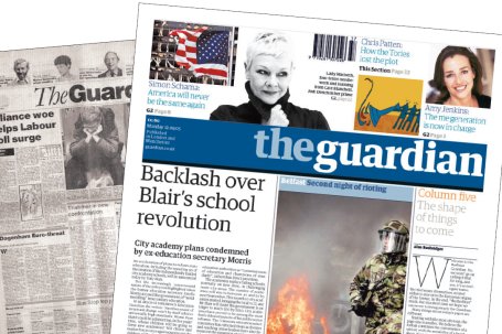
For this I decided to use areal film review bodiy, the newspaper 'The Guardian'.
The BBFC age classification was chosen to represent the minimum age of the target audience.
Thursday, 17 December 2009
New Rough Cut
The new rough cut based on the new ideas and also the audience feedback recieved since is below.
General Feedback that we gained was:
- We still needed to make clear that the father is dead
- Some sounds do not fit e.g. Thump for Shocked little boy, and when dropping medal.
- Father is very quiet
Changes due to Feedback
We will add in a voice over at the beginning and tweek the sound levels of certain parts.
Subscribe to:
Posts (Atom)